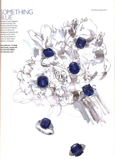
They are so simple yet so effective, the simplistic ink drawings on a white background with only jewellery as actual items, strips back the craziness of a typical wedding, especialy a royal wedding, and focuses on what really matters, the couple. I think this is a direction we could take with our images..
Change the chaos for calm.
Rachel
Tatler, Feb 2011, Collectors edition


As we are doing the something old, something new...... for the pictures how are we going to in-coporate the shooting image with the babour jacket and hunters?.. i came up with the idea this could be 'something new', as it is a sport the royals are known for and is a sign of the upperclass so it could be something Kate will participate in in the future?
ReplyDeleteCharlotte Woodend
Yeah thats a really good idea, think we have worked out what we are doing for each now just the something borrowed needs sorted.
ReplyDeleteOur images could be simple like this, with plain backgrounds etc.. just an idea
Rachel
yeah for another idea we could edit them to look like a magazine spread, like your examples above with a title for each and slight descrption i love how on your examples they have cut out rings and scattered them among the page.
ReplyDeleteCharlotte Woodend
i love these simple illustrations , the black ink on a white background is simple yet effective.the watercolour pale blue wash to lightley colour the drawings is a nice subtle touch . I think they would be best edited into a magazine spread like what will kate be feeling thinking up to the wedding what will she be doin after - hunting etc ...
ReplyDeletecharlotte oloughlin x